Foyer Refresh
Hello hello! I hope you all had a great, long holiday weekend! I am feeling very tired and struggling to get back into the swing of things, but on the bright side, at least it’s a short work-week!
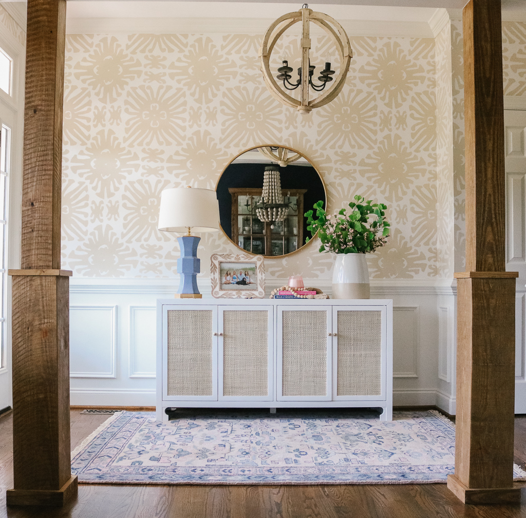
If you follow along on my Instagram stories, you know that we recently had our foyer updated! Wallpaper has been making a major comeback, and I have been wanting to incorporate it into this space for a long time. Finding the perfect paper and committing to it proved to be a challenge, which is funny because I am usually very decisive. I originally went into this thinking I wanted a navy and white printed wallpaper to coordinate with the navy walls in the dining room, but surprisingly I went with a neutral pattern and I could not love it more! It adds the perfect amount of visual interest without being too overpowering. The color scheme of navy, French blue, blush, white and taupe are so refreshing and flow well with our living room which has the same color palette.
When I get a house project on my mind, I usually start scheming and planning MONTHS in advance (and then saving, haha!). I browse the internet to get lots of ideas and compare various options before pulling the trigger. When it comes to decorating our home, I have learned that quality over quantity is always better, and that sometimes you have to be patient to get what you truly want. In the end, the wait is always worth it!
I am so excited to show you all the details here, including a little before & after comparison! All sources are listed at the end of the post! So here we go…
Before:

After:

The wood columns were added last fall, so they’re a fairly new addition but I did not have a photo with the prior columns. They were the round, white traditional columns that are more of a “builder basic” look. They did not go with the rest of our home, so we had them replaced with these reclaimed wood columns. They have been a great addition! If you are local, I can provide you with the contact information for the craftsmen who did this…just let me know!


Sources:
- Wallpaper is by Quadrille and it is the “Sigourney” in Taupe on White. If you are local, I ordered through TDG Interiors (on Instagram @TDGInteriors)
- Trim is Sherwin Williams and was color matched to Benjamin Moore White Dove
- Rug
- Light Fixture – I bought ours several years ago but this looks to be the exact same one
- Mirror – I bought the mirror last year from Hobby Lobby. Similar here, here and here
- Cabinet – Also here
- On the cabinet:
- Whiskey in a Teacup book
- Candle – the scent is “Peony Blush” and it smells ah-mazing!
- Wood beads and picture frame are from Hobby Lobby
- In the bookshelves:
- Blue picture frame
- Blush picture frame
- Paris in Bloom book
- New York in Bloom book
- India Hicks book
- All other decorative items came from Hobby Lobby & Marshall’s
Shop the Post:
I hope you enjoyed this post! I would love to share more home updates with you in the future, so let me know if that is something you would be interested in seeing! Have a great day!


Comments (2)
Jennifer
May 28, 2019 at 12:15 pm
I love all the details in your photos! It’s so beautiful! Can you please come decorate my house ?
Xoxoxo
Shannon Aycock
May 28, 2019 at 11:37 pm
Thanks girl!! Would love to decorate your place!! Xoxo!
Comments are closed.